08 Visualizations of Model Performance
Published: June, 2024, ATOM DDM Team
Please check out the companion tutorial video: ![]()
In this tutorial, we will use some of the tools provided by AMPL to visualize the model training process and the performance of the final model. Some of the tools we’ll apply here are only applicable to certain classes of models; as we go along we will indicate where each function can be applied.
The tutorial will present the following functions, all from the
perf_plots module:
We will use the same training dataset and scaffold split as in Tutorial 3, “Train a Simple Regression Model”, to create some neural network models and visualize their iterative training process. Later, we’ll generate a binary classification dataset based on the same data, so we can train classification models and show the visualizations that are specific to classifiers. For starters, let’s import some standard packages and modules:
import pandas as pd
import numpy as np
import json

# Set for less chatty log messages
import logging
logger = logging.getLogger('ATOM')
logger.setLevel(logging.INFO)

from atomsci.ddm.pipeline import model_pipeline as mp
from atomsci.ddm.pipeline import parameter_parser as parse
from atomsci.ddm.pipeline import perf_plots as pp
Visualizing the Training Process for a Neural Network Regression Model
When you train a neural network model,
AMPL makes a series of
iterations through the entire training subset of your curated dataset;
each iteration is called an epoch. At the end of each epoch,
AMPL saves the model
parameters (i.e., the weights of each network connection) in a
checkpoint file. It then computes and stores a set of metrics describing
the model’s performance at that stage of training: the \(R^2\) value
for regression models and the ROC AUC for classification models. By
default these metrics are used to select the epoch yielding the best
validation set performance; but you may choose a different metric by
setting the model_choice_score_type parameter. The metrics are
evaluated separately for the training, validation and test subsets.
Generally, the training set metrics continue to improve with more
epochs, while the validation and test set metrics reach a peak and then
decline, as the model becomes overfitted to the training subset. The
function plot_perf_vs_epoch allows you to visualize this process.
The code below will train a simple fully-connected neural network on the
SLC6A3
dataset. By default,
AMPL uses an early
stopping algorithm to terminate training if the chosen validation set
metric peaks and does not improve further after a certain number of
epochs, set by the early_stopping_patience parameter. Here we tell
AMPL to optimize the
root mean squared error (RMSE) rather than \(R^2\), to train for
up to 100 epochs, and to stop training if the RMSE does not improve
for 20 epochs after reaching a minimum.
dataset_file = 'dataset/SLC6A3_Ki_curated.csv'
output_dir='dataset/SLC6A3_models'

response_col = "avg_pKi"
id_col = "compound_id"
smiles_col = "base_rdkit_smiles"
split_uuid = "c35aeaab-910c-4dcf-8f9f-04b55179aa1a"

params = {
        # dataset info
        "dataset_key": dataset_file,
        "id_col": id_col,
        "smiles_col": smiles_col,
        "response_cols": response_col,
        # splitting
        "previously_split": "True",
        "split_uuid" : split_uuid,
        "splitter": 'scaffold',
        "split_valid_frac": "0.15",
        "split_test_frac": "0.15",
        # featurization
        "featurizer": "computed_descriptors",
        "descriptor_type" : "rdkit_raw",
        # model training parameters
        "model_type": "NN",
        "prediction_type": "regression",
        "layer_sizes": "128,32",
        "dropouts": "0.2, 0.2",
        "max_epochs": "100",
        "early_stopping_patience": "20",
        "model_choice_score_type": "rmse",
        "verbose": "True",
        "result_dir": output_dir,
        "verbose": "True",
    }

ampl_param = parse.wrapper(params)
regr_pipe = mp.ModelPipeline(ampl_param)
regr_pipe.train_model()
['dataset/SLC6A3_models/SLC6A3_Ki_curated/NN_computed_descriptors_scaffold_regression/362b134a-924b-4549-a341-cffb5ba36757/model/checkpoint1.pt', 'dataset/SLC6A3_models/SLC6A3_Ki_curated/NN_computed_descriptors_scaffold_regression/362b134a-924b-4549-a341-cffb5ba36757/model/checkpoint2.pt', 'dataset/SLC6A3_models/SLC6A3_Ki_curated/NN_computed_descriptors_scaffold_regression/362b134a-924b-4549-a341-cffb5ba36757/model/checkpoint3.pt', 'dataset/SLC6A3_models/SLC6A3_Ki_curated/NN_computed_descriptors_scaffold_regression/362b134a-924b-4549-a341-cffb5ba36757/model/checkpoint4.pt', 'dataset/SLC6A3_models/SLC6A3_Ki_curated/NN_computed_descriptors_scaffold_regression/362b134a-924b-4549-a341-cffb5ba36757/model/checkpoint5.pt']
dataset/SLC6A3_models/SLC6A3_Ki_curated/NN_computed_descriptors_scaffold_regression/362b134a-924b-4549-a341-cffb5ba36757/model/checkpoint1.pt
We now use the plot_perf_vs_epoch function to show how the
performance metrics change during training:
pp.plot_perf_vs_epoch(regr_pipe)
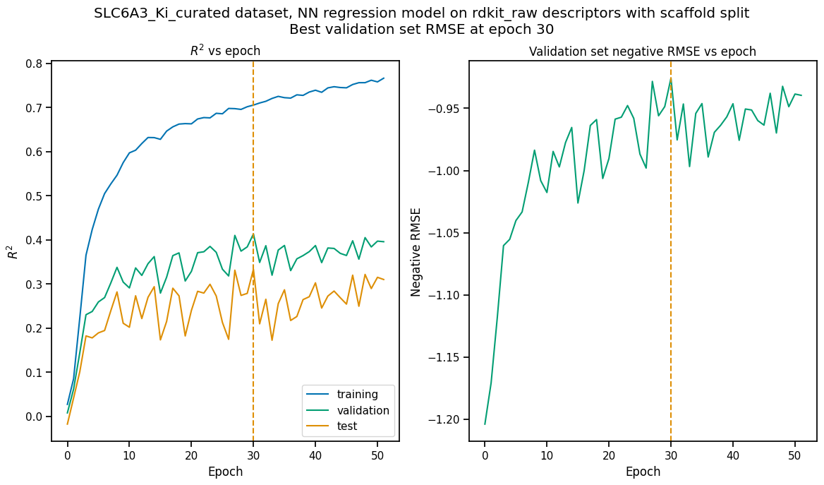
The vertical dashed lines indicate the epoch at which the validation set RMSE was minimized; the parameters retrieved from the checkpoint file for this epoch are the ones saved in the model file.
When the model is trained to optimize the default score type (\(R^2\) or ROC AUC), only the left hand plot is drawn. Note that the epoch with the maximum \(R^2\) may or may not be the same as the one that minimizes RMSE.
Note
The “pipe” argument to “plot_perf_vs_epoch” is a “ModelPipeline” object for a model you have trained in your current Python session; it doesn’t work with a previously saved model that you’ve loaded using a function like “create_prediction_pipeline_from_file”.
Comparing Predicted with Actual Values by Split Subset
There are times when a single number like \(R^2\) or RMSE is not enough to give you a feeling for how well your model is performing (or more importantly, where it is failing). For this reason, AMPL provides a function to produce a scatterplot of predicted vs actual values for each split subset, as shown below.
pp.plot_pred_vs_actual(regr_pipe)

The plots highlight a couple of interesting features of the training dataset. First, the vertical lines of points with actual value 5 represent censored data, where the \(K_i\) values were reported as “> 10 µM” because the maximum concentration tested did not allow higher \(K_i\) values to be measured precisely. Second, you’ll note that higher \(K_i\) values tend to be underpredicted and lower \(K_i\)’s are overpredicted, even for the training subset. This suggests that model performance could be improved by further hyperparameter optimization.
As with plot_perf_vs_epoch, the plot_pred_vs_actual function
only works with “live” ModelPipeline objects trained in the current
Python session. However, there is an alternative version of this
function specifically for saved models. We’ll try out this function on
the best random forest model from the hyperparameter searches
performed in Tutorial 5, “Hyperparameter Optimization”:
pp.plot_pred_vs_actual_from_file('dataset/SLC6A3_models/SLC6A3_Ki_curated_model_9b6c9332-15f3-4f96-9579-bf407d0b69a8.tar.gz')

The points predicted by the optimized RF model are indeed closer to the identity line, as one would expect from the higher \(R^2\) scores. Although the lower \(K_i\) values are still overpredicted in the validation and test sets, the spread of predicted values above the identity line is much reduced.
Visualizations of Classification Model Performance
Classification models are trained to assign compounds to one of a set of discrete, often binary classes: active/inactive, agonist/antagonists of particular receptors, etc. They are evaluated using different performance metrics than regression models; in most cases these call for completely different visualization tools. In this section of the tutorial, we will construct a binary classification dataset, train a model against it, and use it to demonstrate some of the visualizations provided by AMPL specifically for classification models.
To create a binary classification dataset, we will simply add a column called ‘active’ to the SLC6A3 \(K_i\) dataset containing “1” for compounds with \(pK_i \ge 8\) and “0” for all others:
dset_df = pd.read_csv('dataset/SLC6A3_Ki_curated.csv')
dset_df['active'] = [int(Ki >= 8) for Ki in dset_df.avg_pKi.values]
classif_dset_file = 'dataset/SLC6A3_classif_pKi_ge_8.csv'
dset_df.to_csv(classif_dset_file, index=False)
dset_df.active.value_counts()
active
0    1597
1     222
Name: count, dtype: int64
Note that we have purposely created an imbalanced dataset, with many more inactive than active compounds. This provides us an opportunity to apply some of the tools AMPL supplies to deal with this common situation.
Next we will split the dataset by scaffold:
output_dir='dataset/SLC6A3_models'
params = {
    # dataset info
    "dataset_key" : classif_dset_file,
    "response_cols" : "active",
    "id_col": "compound_id",
    "smiles_col" : "base_rdkit_smiles",
    "result_dir": output_dir,

    # splitting
    "split_only": "True",
    "previously_split": "False",
    "splitter": 'scaffold',
    "split_valid_frac": "0.15",
    "split_test_frac": "0.15",

    # featurization & training params
    "featurizer": "ecfp",
}
pparams = parse.wrapper(params)
split_pipe = mp.ModelPipeline(pparams)
split_uuid = split_pipe.split_dataset()
It is often a good idea, especially with imbalanced datasets, to check
that the class proportions are similar between the split subsets. The
function plot_split_subset_response_distrs, which we encountered in
Tutorial 2, “Splitting Datasets for Validation and Testing”,
provides a way to do this. Note that when the prediction_type
parameter is set to classification, the function produces a bar
graph rather than a density plot:
import atomsci.ddm.utils.split_response_dist_plots as srdp
split_params = {
    "dataset_key" : classif_dset_file,
    "smiles_col" : "base_rdkit_smiles",
    "prediction_type": "classification",
    "response_cols" : "active",
    "split_uuid": split_uuid,
    "splitter": 'scaffold',
}
srdp.plot_split_subset_response_distrs(split_params)

The proportion of actives is fairly even across the split subsets. We will check later to see if the higher percentage of actives in the training set causes the model to predict too many false positives.
Now we will train a neural network to predict compound classes using ECFP fingerprints as features:
params = {
    # dataset info
    "dataset_key" : classif_dset_file,
    "response_cols" : "active",
    "id_col": "compound_id",
    "smiles_col" : "base_rdkit_smiles",
    "result_dir": output_dir,

    # splitting
    "split_uuid": split_uuid,
    "previously_split": "True",
    "splitter": 'scaffold',
    "split_valid_frac": "0.15",
    "split_test_frac": "0.15",

    # featurization & training params
    "featurizer": "ecfp",
    "prediction_type": "classification",
    "model_type": "NN",
    "layer_sizes": "128,64",
    "dropouts": "0.3,0.3",
    "learning_rate": "0.0002",
    "max_epochs": "100",
    "early_stopping_patience": "20",
    "verbose": "True",
}
pparams = parse.wrapper(params)
classif_pipe = mp.ModelPipeline(pparams)
classif_pipe.train_model()
['dataset/SLC6A3_models/SLC6A3_classif_pKi_ge_8/NN_ecfp_scaffold_classification/5aae26e9-1bbd-4f6c-8662-c7baae078bee/model/checkpoint1.pt', 'dataset/SLC6A3_models/SLC6A3_classif_pKi_ge_8/NN_ecfp_scaffold_classification/5aae26e9-1bbd-4f6c-8662-c7baae078bee/model/checkpoint2.pt', 'dataset/SLC6A3_models/SLC6A3_classif_pKi_ge_8/NN_ecfp_scaffold_classification/5aae26e9-1bbd-4f6c-8662-c7baae078bee/model/checkpoint3.pt', 'dataset/SLC6A3_models/SLC6A3_classif_pKi_ge_8/NN_ecfp_scaffold_classification/5aae26e9-1bbd-4f6c-8662-c7baae078bee/model/checkpoint4.pt', 'dataset/SLC6A3_models/SLC6A3_classif_pKi_ge_8/NN_ecfp_scaffold_classification/5aae26e9-1bbd-4f6c-8662-c7baae078bee/model/checkpoint5.pt']
dataset/SLC6A3_models/SLC6A3_classif_pKi_ge_8/NN_ecfp_scaffold_classification/5aae26e9-1bbd-4f6c-8662-c7baae078bee/model/checkpoint1.pt
As we did before for a regression model, we use the function
plot_perf_vs_epoch to display the changes in the default performance
metric over successive epochs of training. In this case only one plot is
drawn because we are using the default metric (ROC AUC) evaluated on
the validation set to decide when to stop training.
pp.plot_perf_vs_epoch(classif_pipe)
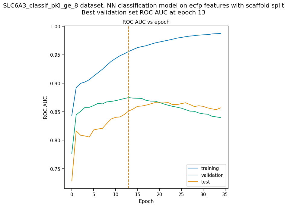
Note that the validation set ROC AUC peaked at only 13 epochs, at around 0.88. Although this seems at first glance like a good result, we need to remind ourselves that our dataset is highly unbalanced, with 1597 inactives and 222 actives. Therefore, a ‘dumb’ classifier that predicts every compound to be inactive will be correct, on average, 1597/(1597+222) = 88% of the time. We need to look at some other metrics to see if our model is doing any better than a dumb classifier.
First, we will plot a confusion
matrix for each
split subset. A confusion matrix is simply a table that shows the
numbers of compounds with each possible class that are predicted to
belong to that class and each other class.
AMPL provides the
function plot_confusion_matrices to draw the confusion matrix for
each subset:
pp.plot_confusion_matrices(classif_pipe)

The confusion matrices show that the model is behaving not much
differently from a dumb classifier. In the validation set, it predicts
the inactive class 97% of the time, even though inactives are only 88%
of the compounds.
AMPL calculates many
other metrics for classification models, which may provide additional
insight into how a model is performing. We can display a barplot of
metric values for each subset using the function plot_model_metrics.
For an unbalanced dataset, the precision and
recall metrics
are far more sensitive indicators of performance than accuracy or ROC
AUC. Here the accuracy is about 0.9, about what would be expected from
a dumb classifier, for all 3 subsets; while the validation set precision
and recall are 100% and 21% respectively. We can also see this from the
confusion matrix: all of the predicted actives are indeed active; but
only 6/28 of the true actives are predicted to be active.
pp.plot_model_metrics(classif_pipe, plot_size=8)

Given the rather mediocre recall performance of our model, we would like
to try training a new model that has better recall without sacrificing
too much precision. One way to do this is to change the
model_choice_score_type parameter to optimize the number of training
epochs for a metric that balances precision and recall. Balanced
accuracy
and the Matthews correlation coefficient
(MCC) are two such
metrics often used for this purpose. We’ll try out using the MCC,
with all other parameters left the same.
params = {
    # dataset info
    "dataset_key" : classif_dset_file,
    "response_cols" : "active",
    "id_col": "compound_id",
    "smiles_col" : "base_rdkit_smiles",
    "result_dir": output_dir,

    # splitting
    "split_uuid": split_uuid,
    "previously_split": "True",
    "splitter": 'scaffold',
    "split_valid_frac": "0.15",
    "split_test_frac": "0.15",

    # featurization & training params
    "featurizer": "ecfp",
    "prediction_type": "classification",
    "model_type": "NN",
    "layer_sizes": "128,64",
    "dropouts": "0.3,0.3",
    "learning_rate": "0.0002",
    "max_epochs": "100",
    "early_stopping_patience": "20",
    "verbose": "True",
    "model_choice_score_type": "mcc",
}
pparams = parse.wrapper(params)
mcc_pipe = mp.ModelPipeline(pparams)
mcc_pipe.train_model()
pp.plot_perf_vs_epoch(mcc_pipe)
['dataset/SLC6A3_models/SLC6A3_classif_pKi_ge_8/NN_ecfp_scaffold_classification/ee6a8fbb-c3f3-4a17-84c1-ffa0ad75a703/model/checkpoint1.pt', 'dataset/SLC6A3_models/SLC6A3_classif_pKi_ge_8/NN_ecfp_scaffold_classification/ee6a8fbb-c3f3-4a17-84c1-ffa0ad75a703/model/checkpoint2.pt', 'dataset/SLC6A3_models/SLC6A3_classif_pKi_ge_8/NN_ecfp_scaffold_classification/ee6a8fbb-c3f3-4a17-84c1-ffa0ad75a703/model/checkpoint3.pt', 'dataset/SLC6A3_models/SLC6A3_classif_pKi_ge_8/NN_ecfp_scaffold_classification/ee6a8fbb-c3f3-4a17-84c1-ffa0ad75a703/model/checkpoint4.pt', 'dataset/SLC6A3_models/SLC6A3_classif_pKi_ge_8/NN_ecfp_scaffold_classification/ee6a8fbb-c3f3-4a17-84c1-ffa0ad75a703/model/checkpoint5.pt']
dataset/SLC6A3_models/SLC6A3_classif_pKi_ge_8/NN_ecfp_scaffold_classification/ee6a8fbb-c3f3-4a17-84c1-ffa0ad75a703/model/checkpoint1.pt

Note that the maximum validation set MCC is achieved at epoch 11, while
the ROC AUC is maximized much later at epoch 15. In general, the
metric selected for model_choice_score_type has a much greater
impact for classification models than for regression models.
Now let’s look at the performance metrics for the MCC-optimized model:
pp.plot_model_metrics(mcc_pipe, plot_size=8)

We see that the recall is improved slightly, from 0.21 to about 0.30; while the precision has dropped from 1.0 to 0.6. This may be acceptable or not, depending on your situation. Do you want to minimize the cost of synthesizing and testing compounds that may turn out to be false positives? Or do you want to minimize the chance that your model will overlook a potential blockbuster drug? The numerous selection metrics supported by AMPL give you flexibility to tailor model training according to your priorities.
As an aside,
SLC6A3
provides another option for dealing with unbalanced classification
datasets: the weight_transform_type parameter. Setting this
parameter to “balancing” changes the way the cost function to be
minimized during training is calculated so that compounds belonging to
the minority class are given higher weight in the cost function. This
modification eliminates the incentive for classifiers to always predict
the majority class. This parameter can be combined with the
model_choice_score_type parameter to yield different effects on the
precision and recall metrics:
params = {
    # dataset info
    "dataset_key" : classif_dset_file,
    "response_cols" : "active",
    "id_col": "compound_id",
    "smiles_col" : "base_rdkit_smiles",
    "result_dir": output_dir,

    # splitting
    "split_uuid": split_uuid,
    "previously_split": "True",
    "splitter": 'scaffold',
    "split_valid_frac": "0.15",
    "split_test_frac": "0.15",

    # featurization & training params
    "featurizer": "ecfp",
    "prediction_type": "classification",
    "model_type": "NN",
    "layer_sizes": "128,64",
    "dropouts": "0.3,0.3",
    "learning_rate": "0.0002",
    "max_epochs": "100",
    "early_stopping_patience": "20",
    "verbose": "True",
    "model_choice_score_type": "mcc",
    "weight_transform_type": "balancing",
}
pparams = parse.wrapper(params)
mcc_wts_pipe = mp.ModelPipeline(pparams)
mcc_wts_pipe.train_model()
pp.plot_model_metrics(mcc_wts_pipe, plot_size=8)
['dataset/SLC6A3_models/SLC6A3_classif_pKi_ge_8/NN_ecfp_scaffold_classification/ffe7fda2-5c4e-4e7d-9fef-8bb3e4729f92/model/checkpoint1.pt', 'dataset/SLC6A3_models/SLC6A3_classif_pKi_ge_8/NN_ecfp_scaffold_classification/ffe7fda2-5c4e-4e7d-9fef-8bb3e4729f92/model/checkpoint2.pt', 'dataset/SLC6A3_models/SLC6A3_classif_pKi_ge_8/NN_ecfp_scaffold_classification/ffe7fda2-5c4e-4e7d-9fef-8bb3e4729f92/model/checkpoint3.pt', 'dataset/SLC6A3_models/SLC6A3_classif_pKi_ge_8/NN_ecfp_scaffold_classification/ffe7fda2-5c4e-4e7d-9fef-8bb3e4729f92/model/checkpoint4.pt', 'dataset/SLC6A3_models/SLC6A3_classif_pKi_ge_8/NN_ecfp_scaffold_classification/ffe7fda2-5c4e-4e7d-9fef-8bb3e4729f92/model/checkpoint5.pt']
dataset/SLC6A3_models/SLC6A3_classif_pKi_ge_8/NN_ecfp_scaffold_classification/ffe7fda2-5c4e-4e7d-9fef-8bb3e4729f92/model/checkpoint1.pt

The new model trained using both parameters has even better recall, at the cost of a small reduction in precision.
Incidentally, the detailed metrics underlying the plots above can be
obtained as a nested dictionary using the function
get_metrics_from_model_pipeline:
metrics_dict = pp.get_metrics_from_model_pipeline(mcc_wts_pipe)
print(json.dumps(metrics_dict, indent=4))
{
    "active": {
        "train": {
            "roc_auc": 0.9839738357222929,
            "prc_auc": 0.8866116456224803,
            "accuracy": 0.9269442262372348,
            "precision": 0.6442687747035574,
            "recall": 0.9819277108433735,
            "bal_accuracy": 0.9503134489176217,
            "npv": 0.9970588235294118,
            "cross_entropy": 0.17187009506671735,
            "kappa": 0.7365568068786424,
            "MCC": 0.759997950847689,
            "confusion_matrix": [
                [
                    [
                        1017,
                        90
                    ],
                    [
                        3,
                        163
                    ]
                ]
            ]
        },
        "valid": {
            "roc_auc": 0.8443148688046648,
            "prc_auc": 0.48576226827635516,
            "accuracy": 0.8827838827838828,
            "precision": 0.4411764705882353,
            "recall": 0.5357142857142857,
            "bal_accuracy": 0.7290816326530611,
            "npv": 0.9456066945606695,
            "cross_entropy": 0.32558061545729045,
            "kappa": 0.4184529356943151,
            "MCC": 0.4209629887651163,
            "confusion_matrix": [
                [
                    [
                        226,
                        19
                    ],
                    [
                        13,
                        15
                    ]
                ]
            ]
        },
        "test": {
            "roc_auc": 0.8563411078717201,
            "prc_auc": 0.5286311317357362,
            "accuracy": 0.8717948717948718,
            "precision": 0.41025641025641024,
            "recall": 0.5714285714285714,
            "bal_accuracy": 0.7387755102040816,
            "npv": 0.9487179487179487,
            "cross_entropy": 0.2981516587921453,
            "kappa": 0.4067796610169492,
            "MCC": 0.41403933560541256,
            "confusion_matrix": [
                [
                    [
                        222,
                        23
                    ],
                    [
                        12,
                        16
                    ]
                ]
            ]
        }
    }
}
Plotting ROC and Precision-Recall Curves
A receiver operating characteristic curve is a commonly used plot for assessing the performance of a binary classifier. It is generated from lists of true classes and predicted probabilities for the positive class by varying a threshold on the class probability, classifying as positive the compounds with probability greater than that threshold, and computing the fractions of true and false positives (the true positive rate (TPR) and false positive rate (FPR)). The ROC curve plots the resulting TPRs against the corresponding FPRs; the ROC AUC is simply the area under the ROC curve. The ROC curve for a completely random classifier will be close to a diagonal line running from (0,0) to (1,1), with AUC = 0.5. A perfect classifier has a ROC curve that follows the Y axis and then runs horizontally across the top of the plot.
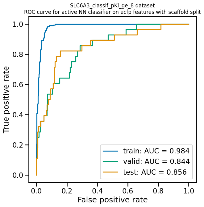
AMPL provides the
function plot_ROC_curve, which takes a ModelPipeline object as
its main argument; it plots separate curves for the training, validation
and test sets on the same axes.
pp.plot_ROC_curve(mcc_wts_pipe)
A precision-recall curve is generated using a similar thresholding process, except that the metrics computed and plotted for each threshold are the precision and recall. Although the precision generally decreases with increasing recall, it usually doesn’t decrease monotonically, especially for imbalanced datasets where the validation and test sets have very small numbers of active compounds.
AMPL provides the
function plot_prec_recall_curve to draw precision vs recall curves
for the training, validation and test sets on one plot. The area under
the curve, also known as the average precision (AP), is computed as
well and shown in the figure legend.
pp.plot_prec_recall_curve(mcc_wts_pipe)

Conclusion
This concludes our series of tutorials highlighting the core functions of AMPL. We hope that completing these tutorials will provide you with the essential skills to train, evaluate and apply your own models for predicting chemical properties. In future versions of AMPL, we will release specialized tutorials covering some of AMPL’s more advanced capabilities, such as multitask modeling, transfer learning, feature importance analysis and more.
If you have specific feedback about a tutorial, please complete the AMPL Tutorial Evaluation.